 Beckonbird Chat Button
Where the line is drawn
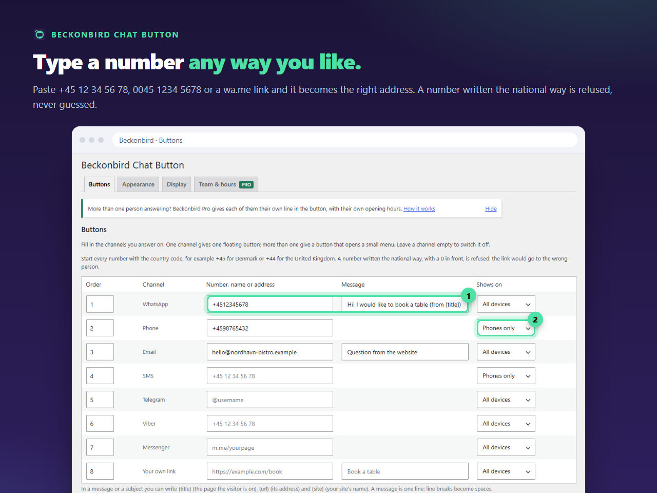
The split is a CSS rule at 768 pixels wide. Narrower than that counts as a phone, which includes a computer’s browser window made narrow. Wider counts as a computer, which includes most tablets. There is no sniffing of the device, so there is nothing to be wrong about.
What visitors see
With two lines set up this way, the button is still a button that opens a small menu, and the menu has one line in it on each kind of device. If that feels like an extra tap for one line, another arrangement is simpler: keep WhatsApp on All devices, because many people use it on a phone as well, and let Phone be the extra line that only phones see. Then a phone has two and a computer has one.
If you want a single link
One channel gives one button with no menu. If your site only ever needs a call on a phone, make Phone the only channel and leave it at Phones only, and the whole button disappears on computers, as in the guide to a mobile-only call button.
Why start with Phone and SMS hidden on computers
A visitor on a computer cannot place a call or send a text from a link in most cases. A line that does nothing is worse than no line, so Phone and SMS start out as phones only, and the other six channels start at all devices. You can change any of them in the same column.